Jump to visualization
Overview
There is a problem with how information is provided to the average person about what is in their food. It is difficult for people to quickly learn about nutrition in order to make good dietary choices. The average person might look at food labels and possibly search for information about ingredients online, but this can be cumbersome and does an incomplete and poor job at informing people what they are eating. This visualization seeks to exemplify how the nutritional value and ingredients in a food can be more easily and clearly presented, allowing the user to make a more informed choice.
The dataset used in the visualization is from the Food Composition Databases, provided by the United States Department of Agriculture: Agricultural Research Service. This dataset contains nutritional values and ingredients for many different foods. Nutrients are divided into the following groups: proximates, minerals, vitamins, and lipids. Proximates include water, energy, protein, total fat, carbs, fiber, and sugars. Examples of minerals are calcium and iron. Lipids include fatty acids. A list of ingredients is also provided. The ingredients are ordered by the amount they are in the food.
The target user for this visualization is Professor Ronald Metoyer. The key task supported by this visualization is for the user to be able to quickly see an overview of what is in a food. Showing the big picture view of a food is important. Professor Metoyer wants the representation of the food to be visually interesting so that at a glance the user can see what a food "looks like". The idea behind this is that foods with different nutritional value should be visually distinct. This allows the user to quickly gauge how healthy a food is. Professor Metoyer is also interested in seeing the general sentiment of ingredients in the food. This task involves seeing if an ingredient is generally thought to be healthy (high positive sentiment) or unhealthy (low positive sentiment). Some foods contain ingredients that users may be unfamiliar with. The ingredients sentiment provides a quick way to measure what people think about that ingredient. To evaluate a food, Professor Metoyer also thought it would be helpful to compare the number of different nutrients and the number of ingredients. The thinking behind this is that a food with many ingredients and few vitamins and minerals might be unhealthy, while a food with few ingredients and many vitamins and minerals might be healthy. In addition to getting an overview of the food, the user can also carry out tasks related to getting more detailed information about each ingredient and nutrient in the food. The use of small multiples also allows the user to make comparisons between different foods. One more supported task is flagging allergies.
Design
The visualization is at the bottom of this page.
There are three main parts to this visualization. First, at the top there is a set of checkboxes, radio buttons, and a text field that allow the user to interact with the visualization. Below the interaction controls, there is one full-size view of a food. To the right of this, there is a small multiple representation of several different foods. Selecting a small chart changes the food shown in the larger chart.
The visual representation of a food consists of two separate bar charts, one of the left for nutrients and one on the right for ingredients. The two bar charts are stuck together to create one glyph to represent the food. The colors, shape, and size of the area formed by the two bar charts is how the user can quickly evaluate the food. Putting the two charts along the same y-axis also allows for easy comparisons between the number of nutrients and number of ingredients. Here is what Chex Mix looks like:
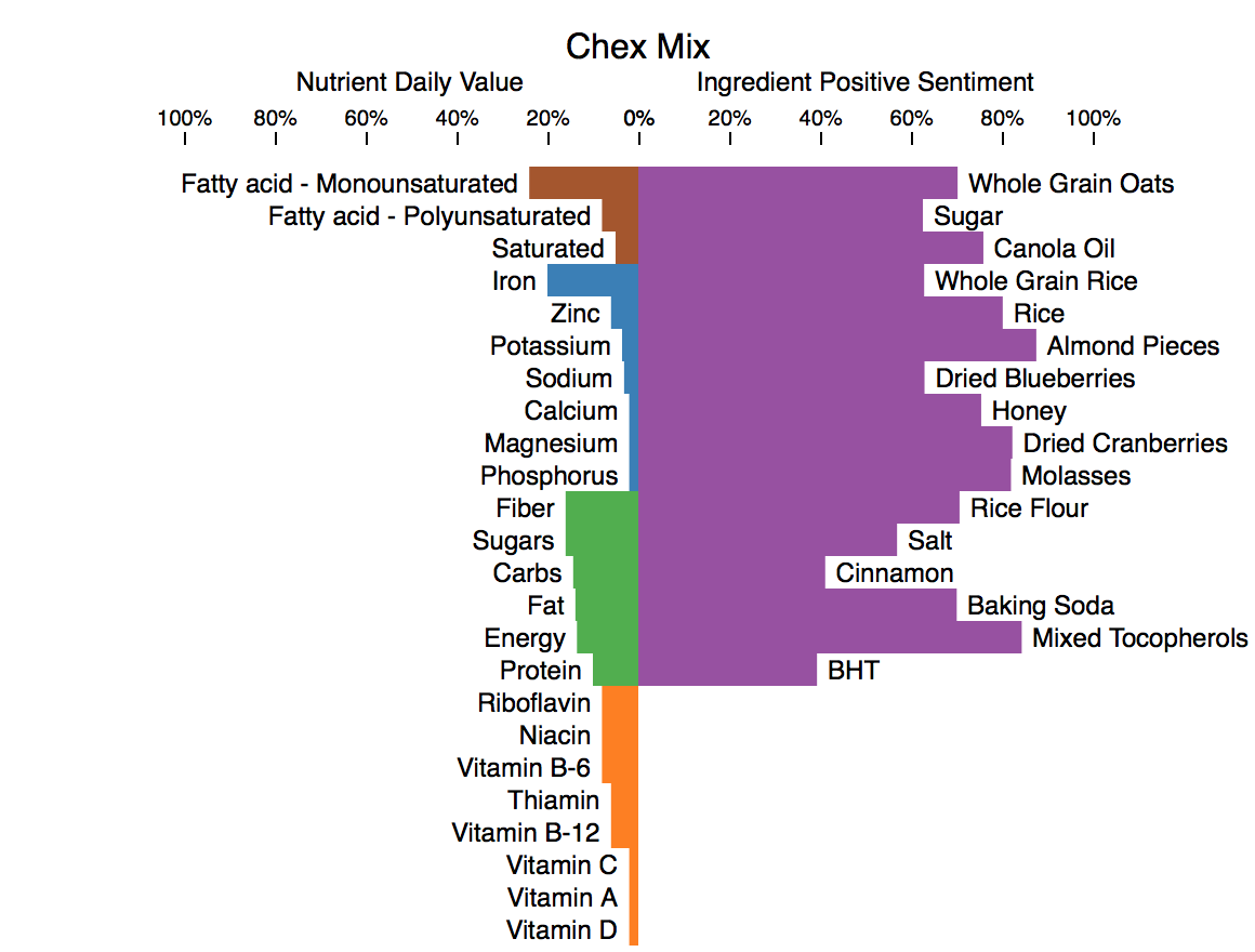
The left-half of the view shows the percent daily value (%DV) for the nutrients in the food. %DV is the amount of a nutrient provided by one serving of the food divided by the recommended daily amount of that nutrient that a person should consume. %DV is a quantitative value, which makes position on a common scale the most effective channel to encode it. Color hue is used to categorize the nutrients into their groups. Brown is for lipids, blue is for minerals, green is for proximates, and orange is for vitamins. Color hue is an effective channel for encoding categorical data.
The right-half of the view shows the percent positive sentiment for the ingredients in the food. Percent positive sentiment is a quantitative value and therefore position on a common scale is a good way to encode it. A longer bar means the ingredient has a higher positive sentiment. Percent positive sentiment is an attempt to measure how healthy an ingredient is based on the general opinion of the ingredient online. A high positive sentiment is good. The percent positive sentiment for an ingredient is determined by searching for the ingredient's name plus the word 'health' on Bing. For example, if the ingredient is salt, then 'salt health' would be the search phrase. Then, the titles and descriptions of the top five results are run through a text sentiment analyzer to get the percent positive sentiment for the ingredient.
The small multiple view is to the right of the larger single view:
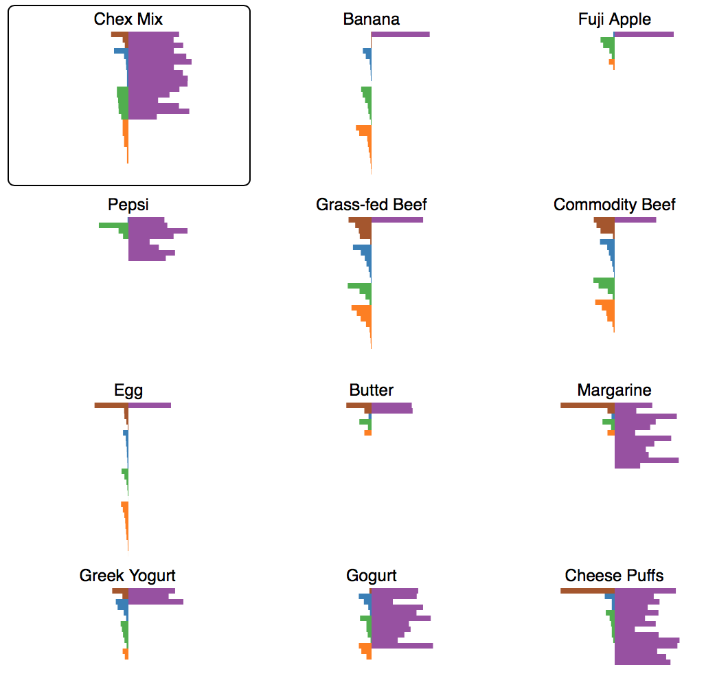
Small multiples are useful for making comparisons and are one of Edward Tufte's composition principles. All of the small multiple charts are coordinated with the larger chart. This means that interactions such as adding allergies, sorting bars, and filtering nutrients affects each chart.
The visualization supports several interactions. Most of them are in the set of controls at the top of the vis:
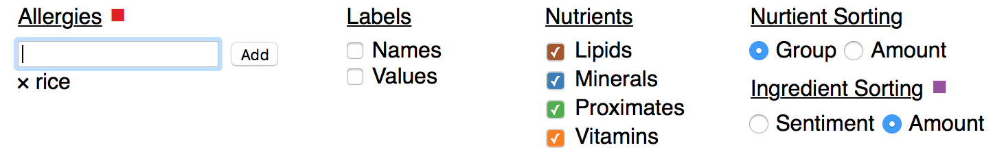
First, there is a text input that allows the user to add allergies, which changes the color of matching ingredient bars to red. This uses color hue to make the ingredient bars effectively popout. Added allergies appear beneath the text input and can be removed by clicking on the 'x' next to them. To the right of the allergies, there are two checkboxes that control how the bars are labeled in the large view. By default, there are no labels. The initial state of the vis aims to quickly give the user an overview of the food. Details such as the names and values of the nutrients and ingredients are not shown. This represents the “overview first” part of Schneiderman’s Mantra. Adding more details would distract the user from the big picture glyph formed by the bars. The labels provide details on demand to the user, such as what nutrient or ingredient each bar represents and the quantitative values for the bars. To the right of the label checkboxes, there is another set of checkboxes that allows the user to filter what nutrients are shown in the charts. Filtering is important because it helps the user focus on parts of the data. For example, the user may only be interested in vitamins and not other nutrient groups. The checkboxes are colored to match the colors of the bars in the chart, which allows the checkboxes to double as a legend. On the far right of the controls, there are sorting options for both ingredients and sentiments. According to Heer and Schneiderman in their paper “Interactive Dynamics for Visual Analysis”, sorting is a fundamental visualization operation and helps the user see different patterns in the data. Nutrients can be sorted by group, with nutrients in the same group sorted by %DV. Or, all the nutrients can be sorted by %DV. Ingredients can be sorted by sentiment or the amount that they are in the food. Sorting by amount puts ingredients in the same order that they are in on food labels.
There are two interactions that are not done with the above controls. First, hovering over a nutrient or ingredient bar brings up a tooltip containing more information. For nutrients, the nutrient name, %DV, and amount are shown. For ingredients, the ingredient name, sentiment, and where it ranks by amount among the other ingredients are shown. Like the labels, the tooltips help to provide details on demand to the user. Second, the user can click on a food in the small multiple view to change which food is shown in the larger view. The currently selected food has a black border around it.
Insights
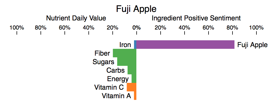
The first insight I gained from this visualization is how little nutritional value is in an apple. Based on apples being fruits and the "an apple a day keeps the doctor away" expression, I would have expected apples to be more nutritious. Fuji Apples have a good amount of fiber and some Vitamin C, but other than that they have few nutrients. It is also worth noting that the %DV for sugar is a bit misleading for apples, since apples contain natural sugar. The Food Composition Database does not distinguish between natural sugar and added sugar. It is added sugar that is unhealthy.
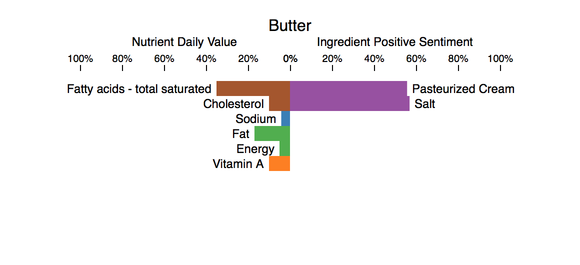
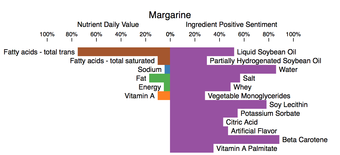
Another insight comes from comparing margarine and butter. Margarine is supposed to be a butter replacement, so it is interesting to see how they are similar and different. The above two images show one tablespoon of butter and margarine. I was surprised to see that they both contain almost exactly the same amount of sodium, fat, energy, and Vitamin A. Margarine does a good job at imitating butter in this regard. The main difference in terms of nutrients is trans fatty acids vs. saturated fatty acids. I was not surprised to see that margarine has more ingredients and seems more processed. I suspect that "Vitamin A Palmitate" is an ingredient in margarine so that it can more closely match the nutrients of butter.
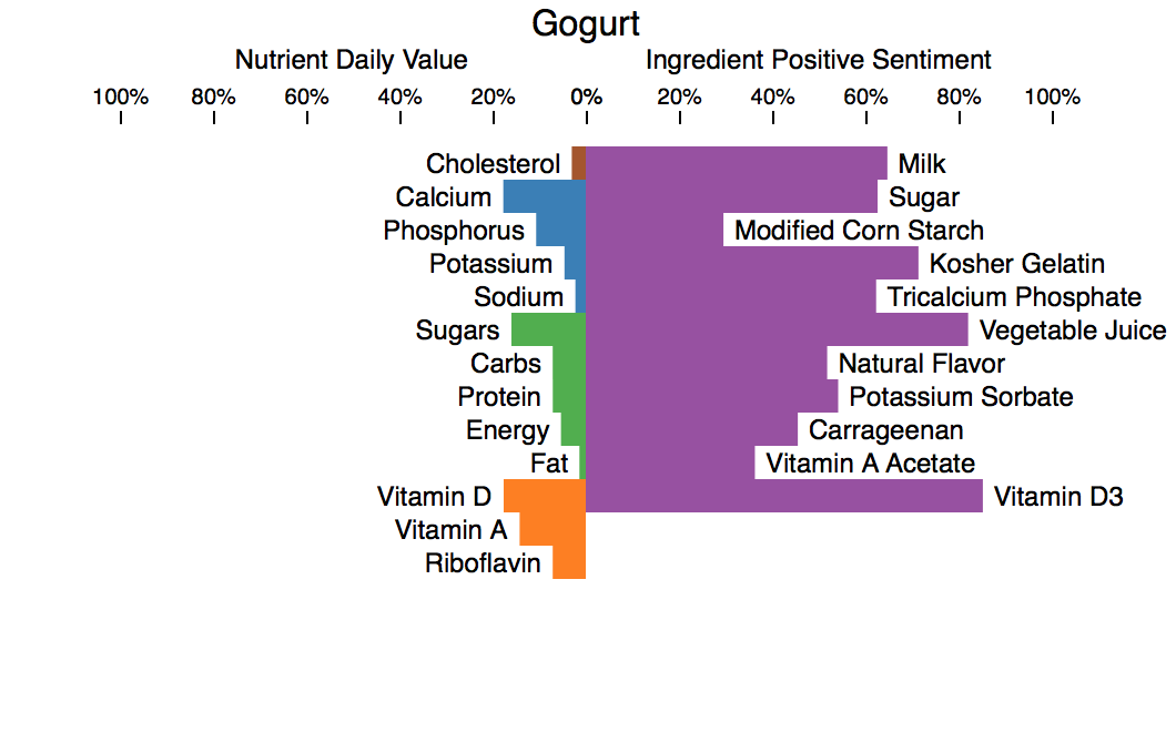
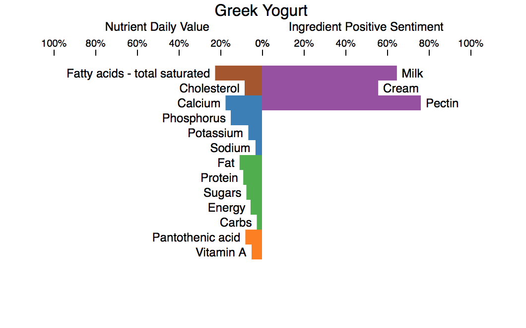
The above two images compare Low-fat Gogurt with Greek yogurt. Each chart shows 1/2 cup of yogurt, which is about two Gogurt tubes. Two notable differences are that Gogurt contains more sugar and less fat than the Greek yogurt. Gogurt is mainly made for kids, which makes the higher sugar content unsurprising. Gogurt also has more Vitamin D and Vitamin A, which is likely due to the presence of Vitamin A Acetate and Vitamin D3 as ingredients. I am surprised by how many more ingredients Gogurt has than the Greek yogurt. The Greek yogurt seems more natural.
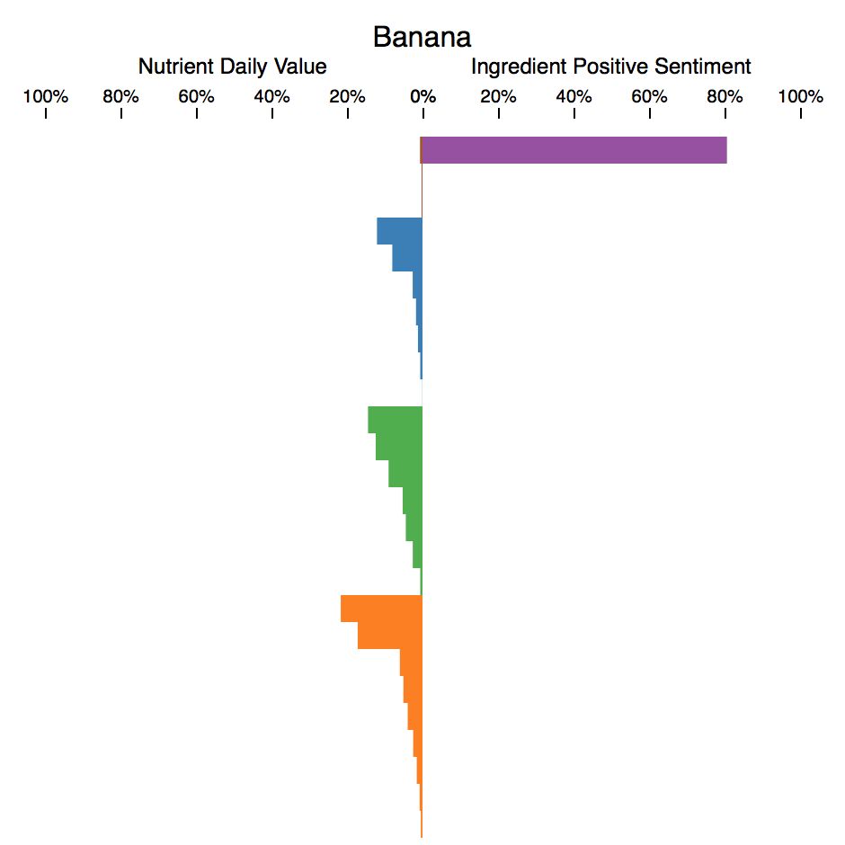
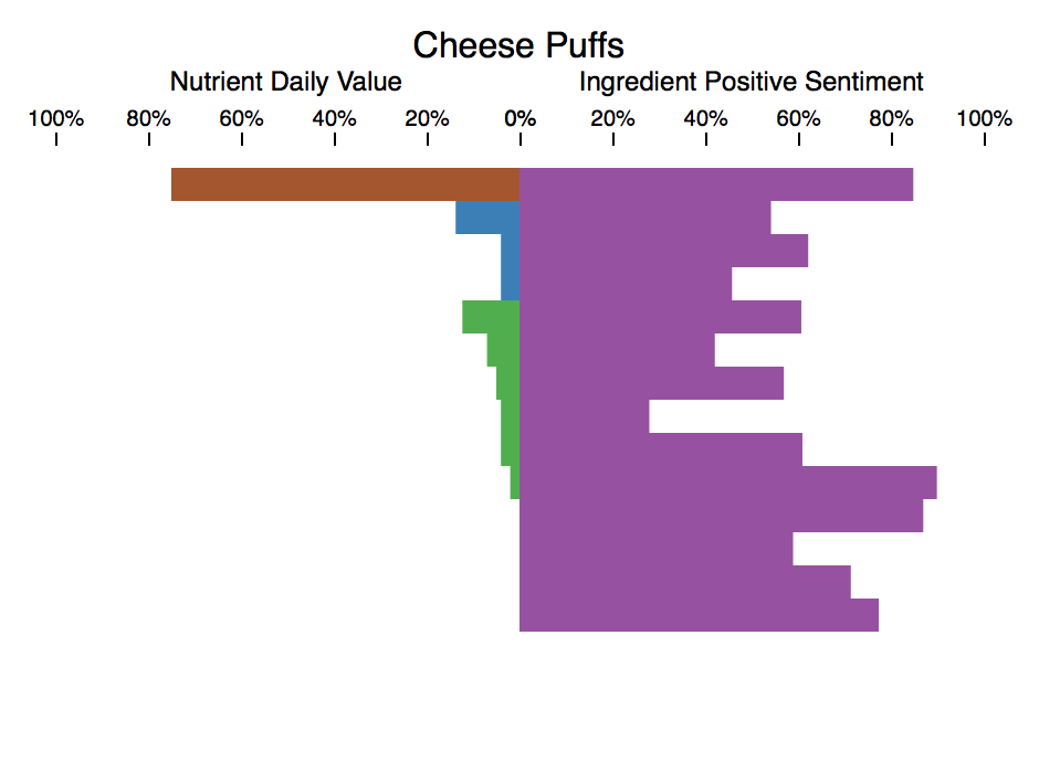
The last thing that I would like to highlight is how healthy and unhealthy foods look different in the visualization. Above, I have chosen one healthy whole food and one processed junk food. At a glance, it is easy to see that the banana is the more nutritious and healthy food. The large amount of blue (minerals) and orange (vitamins) on the left and the single highly positive ingredient on the right for banana helps to indicate that it is healthy. On the other hand, the lack of much orange or blue on the left and the several low positive sentiment ingredients on the right for cheese puffs helps to show that it is unhealthy. The charts for banana and cheese puffs look very different and it is easy to quickly get an overview of the nutritional value of each.
Future
There are many things that I would like to do with this visualization given more time to do it. Right now, the visualization only shows data for specific foods selected from the dataset. It would be nice if the visualization was directly linked with the Food Composition Databases so that the user could choose which foods to visualize, rather than being limited to the ones that I chose. One more additional feature that I would like to add is the ability to filter ingredients from the chart, similar to what can be done currently with nutrients.
The sentiment analysis algorithm for the ingredients could also use improvement. My current method for getting ingredient sentiment is not as effective as I would like it to be. For example, ideally sugar and whole grain rice would not both have positive sentiments of 62%. The sentiment analysis of ingredients aims to gauge how healthy an ingredient is based on what is written about the ingredient online. Perhaps I need to use more text, a better sentiment analyzer, or a different way all together to give the user an indication of how healthy an ingredient is.
During the design and development process, there were a few designs that I would have liked to more fully try out. In particular, I would like to try out a different design for the ingredient bars, where instead of only showing percent positive sentiment in purple, I would show percent positive sentiment in green and then percent negative sentiment in red. Right now, the percent negative sentiment is filled by whitespace. Having each ingredient bar be the same length with different green to red ratios might make it more clear that the bars are showing sentiment and not amount. During evaluations, some users initially found the length encoding for the ingredient bars to be a bit confusing. If I had the time to implement both designs, then I would have been able to get users' preferences during evaluation.